Objective:
1. How to use Q&A Visuals
2. Key Influencer
3. Smart narrative
4. How to use decomposition Tree visual to break down a measure
Objective of AI Visuals:
The fastest way to get an answer is to ask a question by using our own words. Power BI allows you to do exactly that method with its advanced AI capabilities.
One feature of Power BI is that it allows you to ask questions by using natural language, and then it will answer those questions for you.
Similarly, your dataset is likely numerical, where it consists of numbers, amounts, measures, and so on.
You’ve been successfully analyzing this numerical data to get insights. Analyzing non-numerical data can be difficult, but with the AI capabilities of Power BI, you can analyze text data to get more insights than before.
Now, you can analyze this data and transform it into valuable information.
Q&A visual
This ability to ask questions is valuable to you. It gives you ideas for the type of visuals that you can display in your report and lets you quickly add those visuals.
It gives your report users an effective tool that they can use to get quick answers to their questions about the data independently.
To get access to the Q&A feature, you need to add the Q&A visual to your report. You can double-click anywhere on the report canvas, and the visual should appear. Alternatively, you can also select the Q&A icon on the Visualizations pane.

Subscribe to get access
Read more of this content when you subscribe today.
When the Q&A visual or button is added to your report, you can reposition and resize it. You can also customize the formatting in the same way that you would for any other type of visual or button.
You can start asking questions immediately by selecting one of the suggested questions or by entering a question into the question box. As you type, Power BI will automatically display suggestions to help you complete your question.

Q&A setup. Then, select the Teach Q&A option.


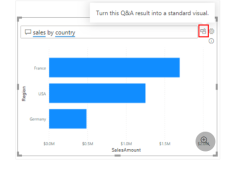
To turn a Q&A result into a standard visual, select the icon next to the question box.

The Q&A feature is unique in that it does not require users to have knowledge of Power BI to use the visual; users can ask their questions, and they, too, can create insightful visuals.
How to use Key influencers visual
Key influencers visually help you understand the factors that drive a metric you’re interested in. It analyzes your data, ranks the factors that matter, and displays them as key influencers.
We can see the factors affect the metric being analyzed
Long term contracts
Under Build visual on the Visualizations pane, select the Key influencers icon

Move the metric you want to investigate into the Analyze field. To see what drives a customer rating of the service to be low, select Customer Table > Rating
Move fields that you think might influence Rating into the Explain by field. You can move as many fields as you want. In this case, start with
2. Country-Region
3. Role in Org
4. Subscription Type
5. Company Size
6. Theme
Leave the Expand by field empty. This field is only used when analyzing a measure or summarized field.

Smart narrative:
Smart narrative visualization helps you quickly summarize visuals and reports. It provides relevant, innovative insights that you can customize.
The smart narrative summary is highly customizable. You can edit or add to the existing text by using the text box commands. For example, you can make the text bold or change its color.

Decomposition tree visuals:
The decomposition tree visual in Power BI lets you visualize data across multiple dimensions.
It automatically aggregates data and enables drilling down into your dimensions in any order.
It’s also an artificial intelligence (AI) visualization, so you can ask it to find the next dimension to drill down into based on certain criteria.
This tool is valuable for ad hoc exploration and conducting root cause analysis.
• Analyze the metric you would like to analyze. It must be a measure or an aggregate.
• Explain by one or more dimensions you would like to drill down into.

These splits appear at the top of the list and are marked with a light bulb. The splits are there to help you find high and low values in the data, automatically.
The analysis can work in two ways depending on your preferences. Using the supply chain sample again, the default behavior is as follows:
•High Value: Considers all available fields and determines which one to drill into to get the highest value of the measure being analyzed.
•
•Low Value: Considers all available fields and determines which one to drill into to get the lowest value of the measure being analyzed.
If you select a different node in the tree, the AI splits recalculate from scratch.
In the example below, we changed the selected node in the Forecast Bias level. The subsequent levels change to yield the correct high and low values.

