

Semantic modeling is a vital method in data representation that emphasizes the meaning of concepts and their interrelationships. It facilitates better understanding, integration, and analysis of complex information by providing a structured framework. This article delves into the steps of creating and exploring a semantic model.
What is a semantic model?
A semantic model is designed to represent knowledge in a form that highlights the meaning of data elements and the relationships among them. Unlike traditional data models that often focus on how data is stored, semantic models are concerned with the meaning and context of the data, making them particularly useful in fields such as artificial intelligence, natural language processing, and semantic web technologies.
Create a data warehouse and load sample data
In the created workspace Fabric Workspace, it’s time to create a data warehouse from New Items as below:

Give the name of the warehouse as Semantic DW Demo as below:
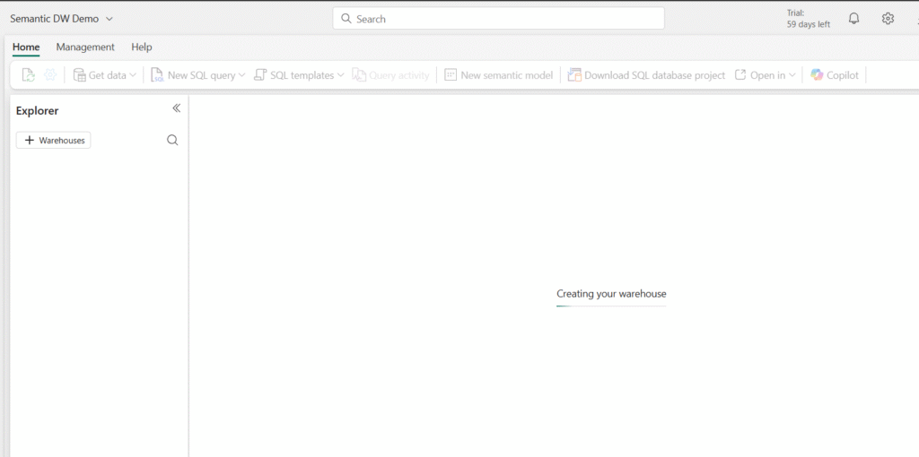
Once the warehouse is created, you can see the below canvas: I will be using sample data to work on the semantic model.
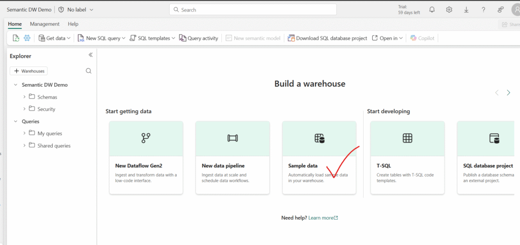
You will also see a few different ways to load data into your warehouse. Select Sample data to load NYC Taxi data into your data warehouse:
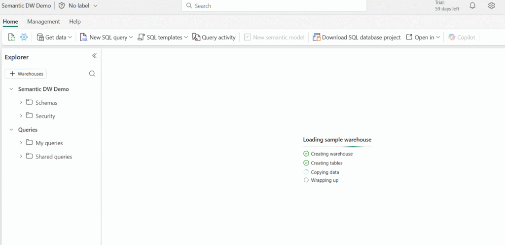
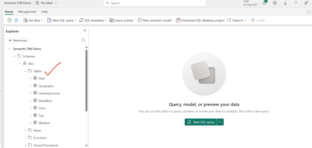
After the sample data has loaded, use the Explorer pane on the left to review the existing tables and views in the sample data warehouse.
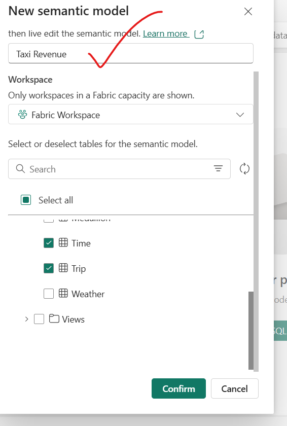
Next, go to the Reporting tab in the ribbon and select New Semantic Model. This allows you to create a tailored semantic model using only the specific tables and views you need from the data warehouse—making it easier for both data teams and business users to build focused, efficient reports.
Name the semantic model “Taxi Revenue”, and ensure it is saved to the workspace you just created. Then, select the following tables to include in your model:
- Date
- Trip
- Geography
- Weather
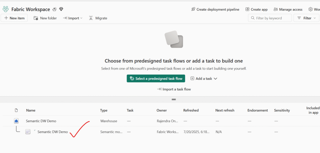
Once created, a semantic model looks like this in the workspace:
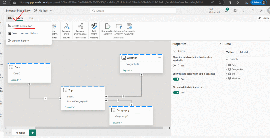
Creating Relationships in Your Custom Semantic Model (Taxi Revenue)
Once your semantic model is created, it’s time to define relationships between tables to ensure accurate analysis and data visualization. If you’re already familiar with creating relationships in Power BI Desktop, this process will feel very familiar.
Step 1: Confirm Your Semantic Model
Navigate back to your workspace and locate your newly created semantic model titled Taxi Revenue. You’ll notice that this model is listed as Semantic model, distinct from the Semantic model (default) which is automatically generated when creating a Warehouse or SQL analytics endpoint in Microsoft Fabric.
Note:
The default semantic model inherits business logic from the Lakehouse or Warehouse it’s tied to. In contrast, a custom semantic model—like the one you just created—offers full flexibility. You can define its structure, logic, and relationships using tools like Power BI Desktop or Power BI Service.
Step 2: Open the Data Model
From the ribbon, select Open data model. This will launch the modeling interface, where you can begin defining the relationships between your tables.
Step 3: Understand the Schema Design
Following the star schema design pattern:
- The Trip table acts as your Fact table—containing measurable, transactional data.
- The Date, Geography, and Weather tables serve as Dimension tables—providing descriptive attributes that enrich your fact data.
This design enhances performance, scalability, and clarity in your reporting.
Step 4: Create Relationships
Let’s start by creating a relationship between the Date and Trip tables:
- In the model view, locate the
DateIDcolumn in the Date table. - Drag the
DateIDcolumn from the Date table and drop it onto theDateIDcolumn in the Trip table. - When prompted, ensure the relationship is defined as:
- One-to-many: From the Date table to the Trip table
- Cross filter direction: Typically single, unless your model needs bidirectional filtering.
This relationship allows your reports to filter and group trips by date attributes like year, month, or day.
Repeat this step to define relationships between:
- Geography[GeographyID] and Trip[GeographyID]
- Weather[DateID] and Trip[DateID] (if applicable, based on model design)
After establishing the foundational relationship between the Date and Trip tables, the next step is to complete the data model by linking the remaining dimension tables: Geography and Weather. This ensures your fact table (Trip) is enriched with location and environmental context, enhancing your reporting capabilities.
Step 5: Create Relationship – Geography to Trip
To analyze trips by their drop-off locations, create a relationship between the Geography table and the Trip table using the GeographyID column:
- In the model view, locate the
GeographyIDcolumn in the Geography table. - Drag
GeographyIDfrom the Geography table onto theDropoffGeographyIDcolumn in the Trip table. - When prompted, confirm the relationship is:
- One-to-many: From Geography to Trip
- DropoffGeographyID acts as the foreign key in the Trip table
This relationship allows you to analyze trip volumes, trends, and KPIs based on drop-off locations, such as neighborhoods or zones.
Step 6: Create Relationship – Weather to Trip
To enable analysis of how weather impacts taxi activity, you’ll connect the Weather table to the Trip table using the same DropoffGeographyID column:
- Locate the
GeographyIDcolumn in the Weather table. - Drag
GeographyIDfrom the Weather table onto theDropoffGeographyIDcolumn in the Trip table. - Confirm the relationship is:
- One-to-many: From Weather to Trip
The final quick of the connections looks as below: Direct lake
cardinality to 1:Many for both relationships.
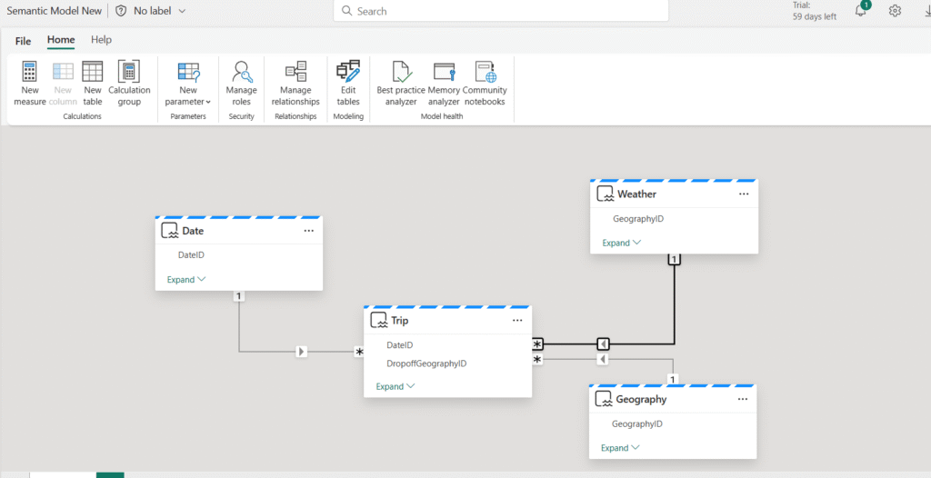
With all relationships now in place, the star schema design of your Taxi Revenue semantic model is complete. This structure forms a robust foundation for efficient querying, clean visualizations, and scalable analytics.
The finalized model consists of:
Fact Table:
Trip—containing transactional taxi ride data
Dimension Tables:
Date – for time-based analysis
Geography—for spatial context based on drop-off location
Weather—to incorporate environmental conditions
Each of these dimension tables is connected to the fact table using one-to-many relationships, supporting a performant and intuitive analysis experience.
With your relationships and star schema now in place, it’s time to make your model easier to understand and use—both for yourself and for others who may build reports on top of it.
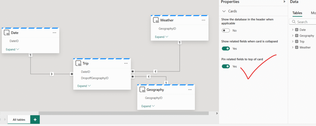
Pin Related Fields for Better Visibility
In the Properties pane, toggle the option “Pin related fields to top of card” to Yes.
Why this matters:
This setting ensures that any fields involved in relationships are displayed at the top of their respective table cards in the model view. This makes it easier to quickly identify how tables are connected, streamlining both model comprehension and maintenance.
Review and Adjust Field Properties
The Properties pane is also a powerful tool for managing and reviewing individual fields:
- Confirm Data Types:
Select any column and verify its data type and formatting (e.g., Date, Decimal, Whole Number, Text). Ensuring correct types supports accurate calculations and visuals. - Rename Fields for Clarity:
Provide friendly, business-readable names for fields (e.g., renameGeographyIDtoDropoff Location ID) to improve the user experience in Power BI reports. - Set Formatting and Default Summarization:
For numeric fields, you can define default formats (e.g., currency, percentages) and aggregation behavior (e.g., sum, average, count). - Hide Unnecessary Fields:
Hide technical or intermediate columns that aren’t needed for reporting to keep the model clean and focused.
Visualize Your Data in the Semantic Model
With your Taxi Revenue semantic model built and relationships properly defined, it’s time to explore the data to uncover early insights—all without needing to build a full Power BI report.
Step 1: Open the Explore Data View
- Navigate back to your workspace in the Power BI service.
- Locate and select the Taxi Revenue semantic model.
- From the ribbon, choose Explore this data.
Tip:
The Explore data feature provides a streamlined, tabular view of your data. It’s perfect for quick analysis, validation, or exploring trends—without needing to open Power BI Desktop or create full visual reports.
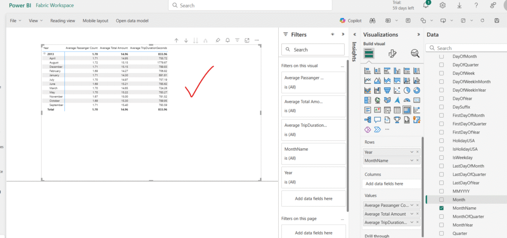
Step 2: Build a Simple Exploration
Once in the explore view:
- Add to Rows:
- Drag YearName and MonthName to the Rows field well.
- This will organize your data chronologically.
- Add to Values:
- Drag the following numeric fields into the Values well:
PassengerCountTripAmountTripDuration
- Drag the following numeric fields into the Values well:
- Change Aggregation to Average:
- Select each numeric field in the Values well.
- In the popup window that appears, change the aggregation from Summarize (Sum) to Average.
Example Insight:
This setup allows you to explore average passenger counts, trip amounts, and durations across different months and years—helpful for spotting trends like seasonal spikes or dips.
Why This Matters
Exploring your data in this way helps validate:
- Relationships are working correctly (i.e., time-based slicing behaves as expected)
- Fields are returning meaningful, accurate values
- Aggregations make sense in context
Once inside the Explore view:
Add Fields to Rows
Drag the following fields into the Rows well:
YearName
MonthName
This will organize your data chronologically, allowing you to explore monthly trends year over year.
Add Fields to Values
Drag the following numeric fields into the Values well:
PassengerCount
TripAmount
TripDuration
These fields will default to a “Sum” aggregation.
Change Aggregation to Average
To analyze average values instead of totals:
Select each field in the Values area.
In the popup window that appears, change the aggregation from Sum to Average.
✅ Tip: You can also right-click on the field and choose Average from the dropdown menu if you prefer a quicker option.
Step 3: Analyze Early Insights
With this setup, you’ll now see a table that shows:
Average number of passengers
Average trip amount
Average trip duration
…for each month, grouped by year.
This view is great for spotting seasonal trends, evaluating growth, and validating that your semantic model behaves as expected.
Once you’ve explored your data in tabular format using the Explore data feature, you can switch to a visual view to better understand trends and comparisons at a glance.
Step 4: View as a Visual
At the bottom of the Explore window:
- Select the Visual tab to switch from table (matrix) view to a chart-based visualization.
- Choose a Bar chart to get a quick visual breakdown of your data.
While a bar chart is a great starting point, it may not always be the most insightful option—especially when working with time-based data like months and years.
🎨 Tip: Experiment with other chart types in the “Rearrange data” section on the right-hand Data pane. Try:
- Line charts for trends over time
- Column charts for quick comparisons
- Area charts for cumulative views
Adjust the fields in the Rows and Values sections to find the most meaningful representation.
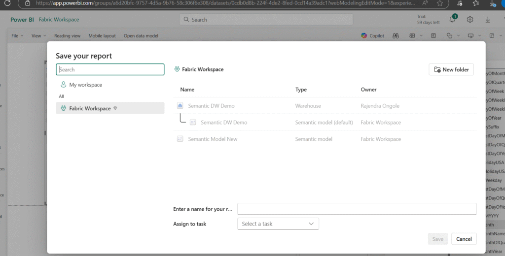
Step 5: Save and Share Your Exploration
Once you’re satisfied with your data view—whether in table or visual format—you can save your exploration for future use or collaboration.
- Save:
Click the Save button in the upper-left corner to store the exploration in your workspace. You can give it a descriptive name, like Monthly Trip Averages or Passenger Trends by Year. - Share:
Use the Share button in the top-right corner to send this exploration to colleagues. Sharing gives others access to view and interact with the data—perfect for team collaboration or quick business reviews.
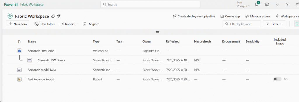
Step 6: Review Your Workspace
After saving, return to your workspace. You’ll now see:
- Your Data Warehouse
- The Default Semantic Model (auto-generated by Microsoft Fabric)
- Your Custom Semantic Model (Taxi Revenue)
- The Saved Exploration view
In this activity, you’ve successfully built a custom semantic model in Microsoft Fabric using data from a warehouse. You:
- Selected and loaded relevant tables into your model
- Defined relationships following a star schema structure
- Optimized the model using the Properties pane
- Explored the data using the Explore data feature
- Visualized and interacted with metrics like average trip duration, passenger count, and fare amount
- Saved and shared your exploration for collaboration
This process sets the foundation for scalable, self-service reporting and insightful analytics in Power BI. By modeling your data correctly and exploring it interactively, you’re not just building visuals—you’re building understanding.
You’re now ready to take the next step: enhance your model with measures, create rich dashboards, and enable decision-makers to gain deeper insights from your data.
Happy Reading!!