
Small multiple charts are a set of charts of the same type on a grid, allowing you to easily compare values over the different other charts.
I’ve imported financial sample dataset. Suppose I want to plot the Profit of the Date month over time with Product category field at small multiple. We are going to get the below chart from Jan-to dec.

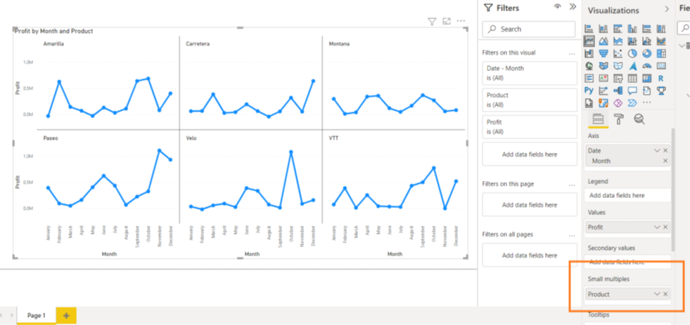
In the above chart we have many datapoints in one graph it has become an clumsy which is not understandable my customer. Small multiples to the rescue! In this scenario In the visualization’s menu, drag the subcategory name from the legend to the small multiples box:

There’s one problem, though: there are 6 sub-categories, and the chart shows 3×2. Which means you have to use the scrollbar to see the last two. This is something you’d want to avoid on a dashboard. Luckily, we can adjust this. With the chart selected, go to the format pane and change the grid layout to either 3 rows or 2 columns.

Now everything fits on one page: with 2 rows and 3 columns we can set in single chart
I like how Power BI doesn’t unnecessarily repeat axis for every chart but rather displays them only on the left at the bottom of chart. Also, all charts have the same scale (0 to 30 in our example), which means it still makes sense to compare the different graphs with each other.

Thank you
Please share your feedback and comments
